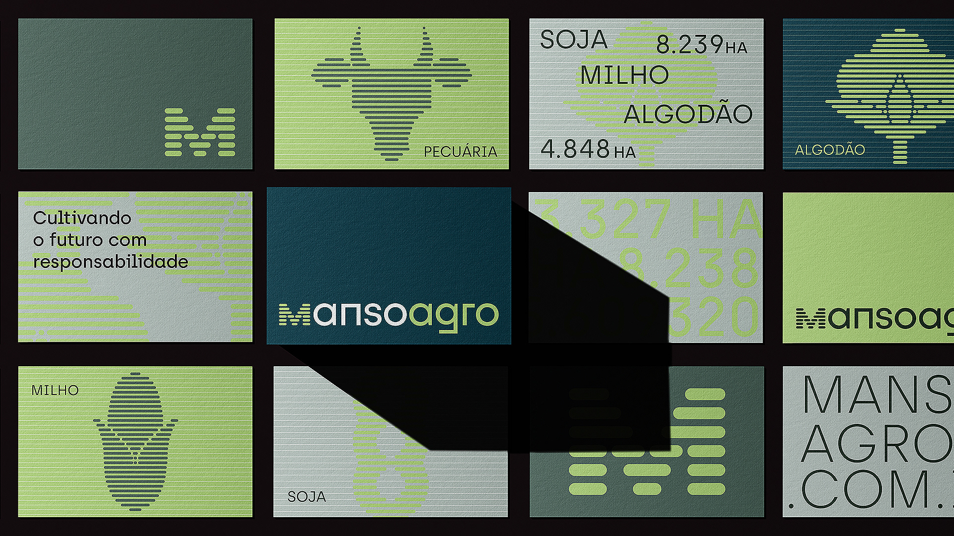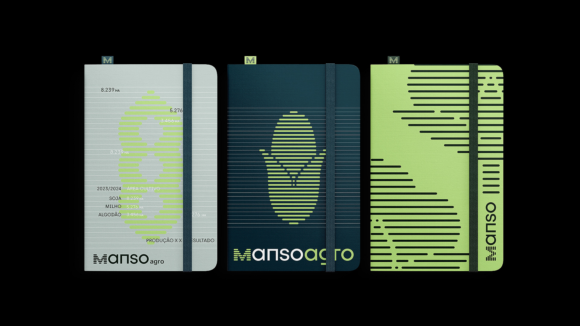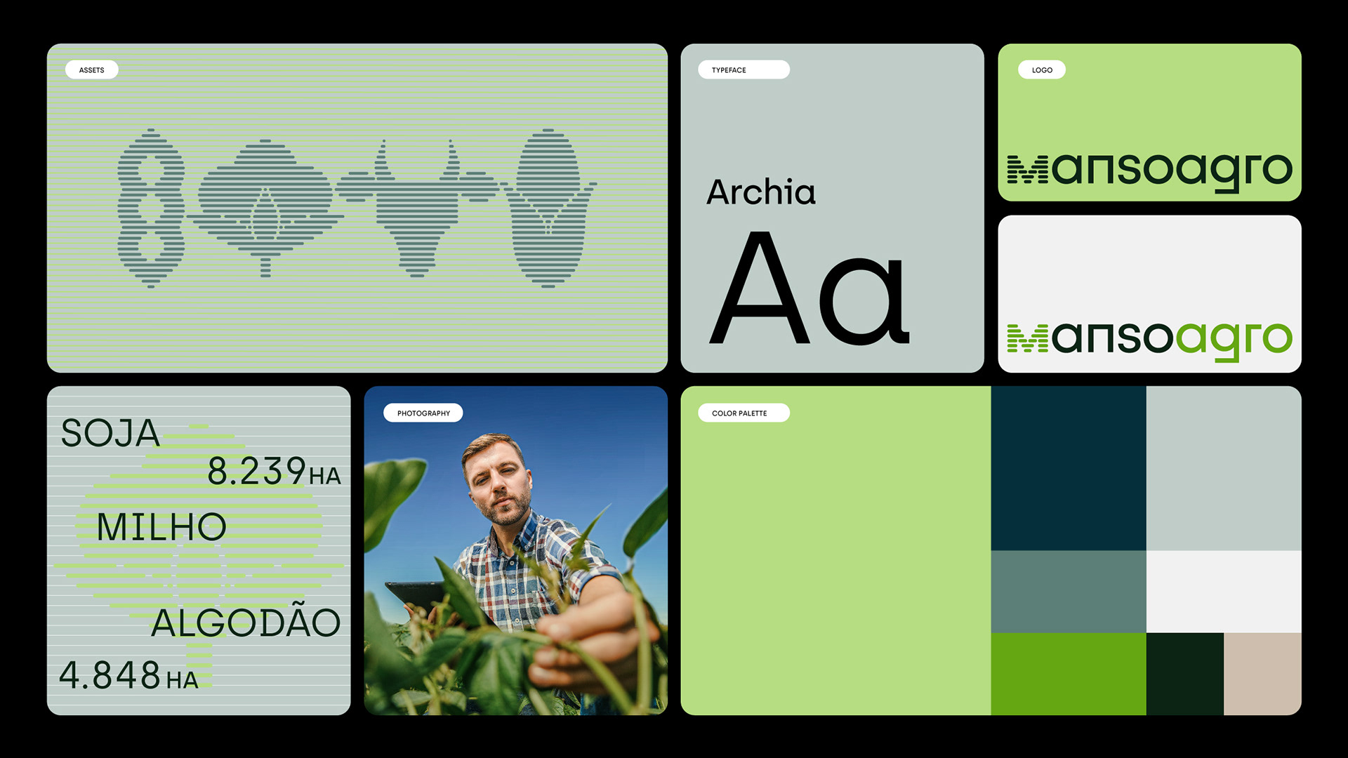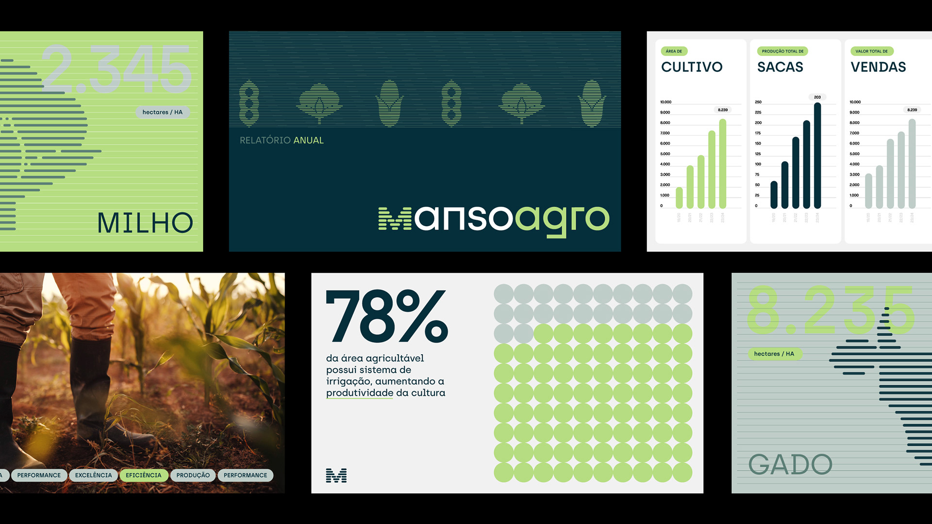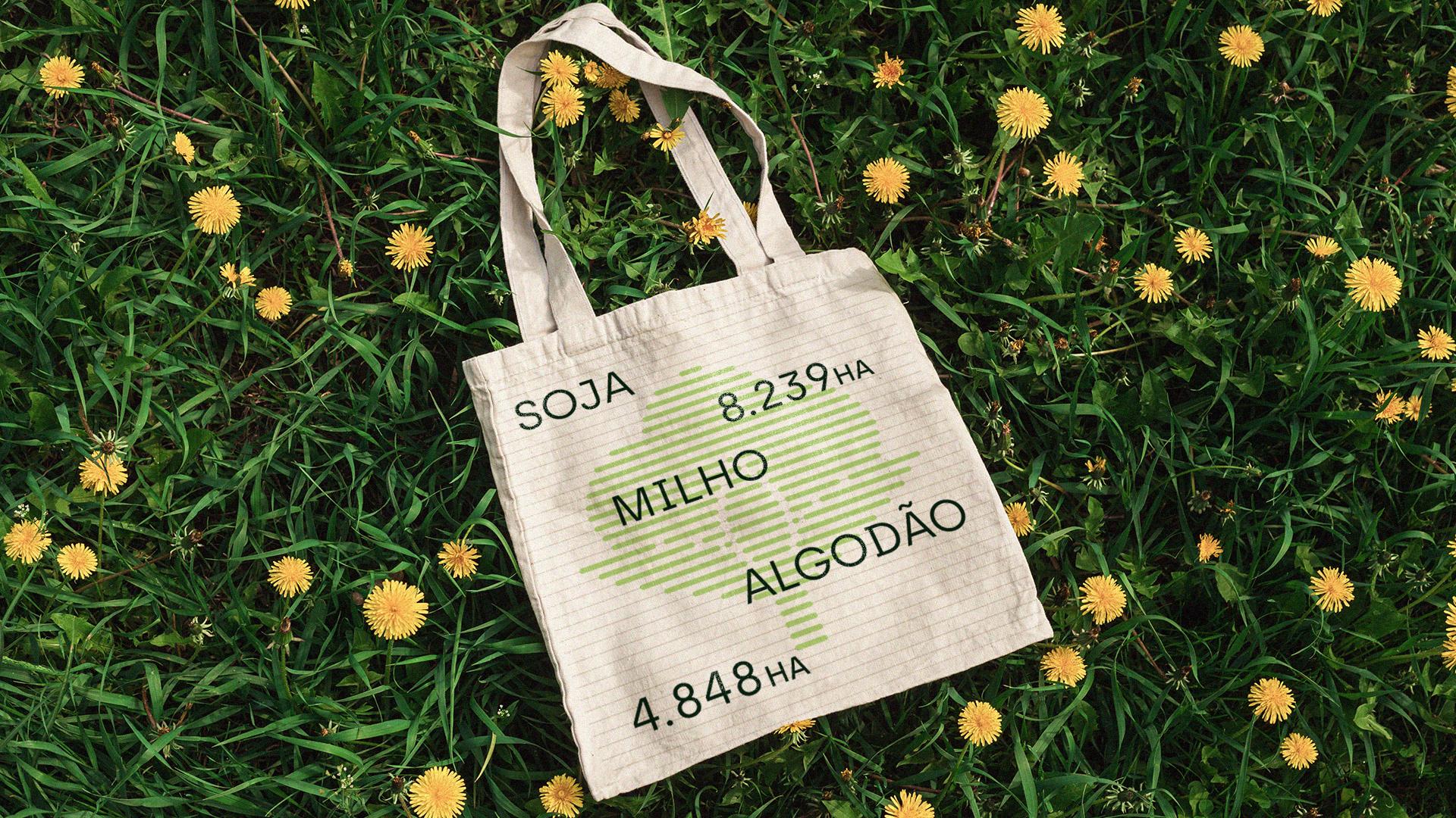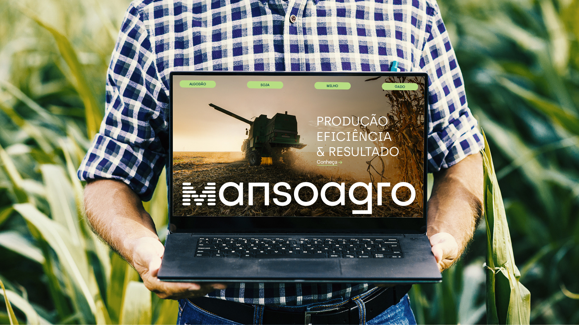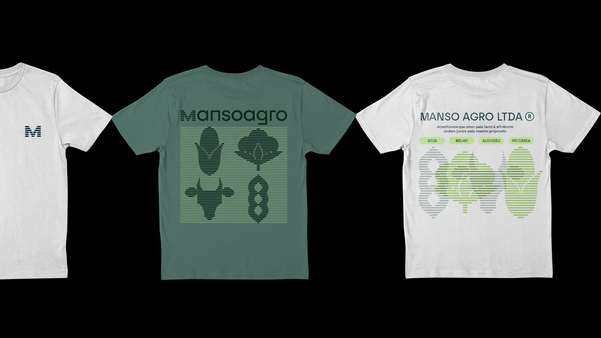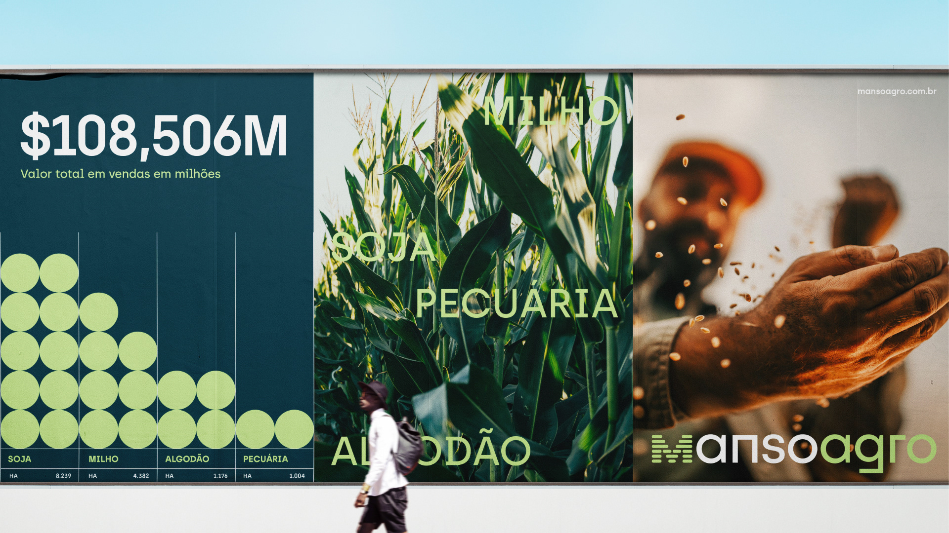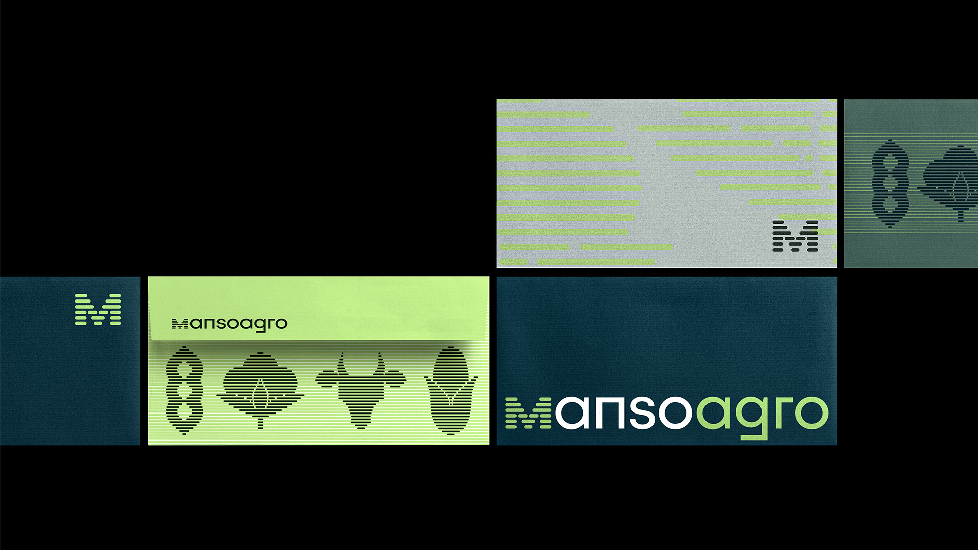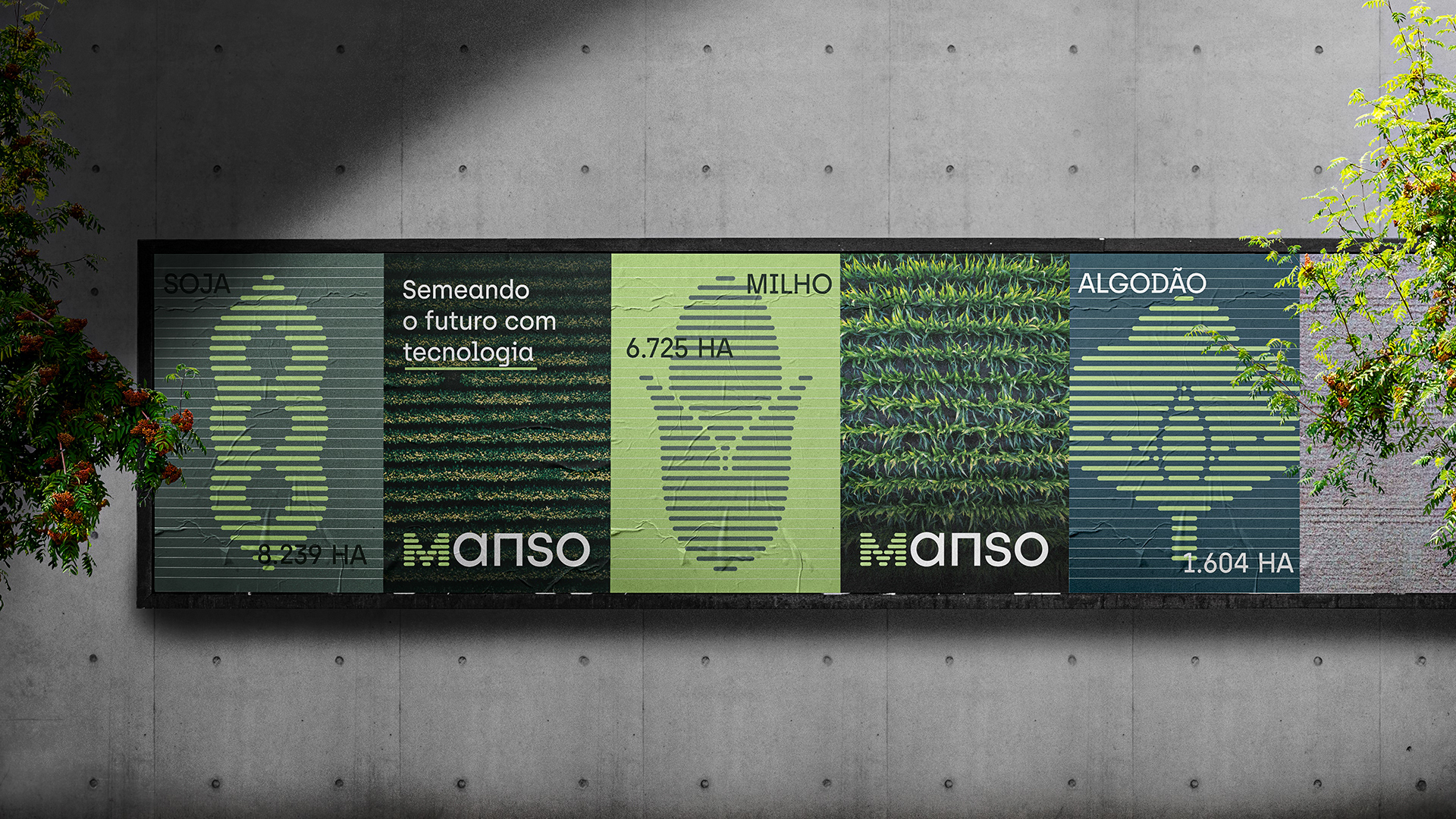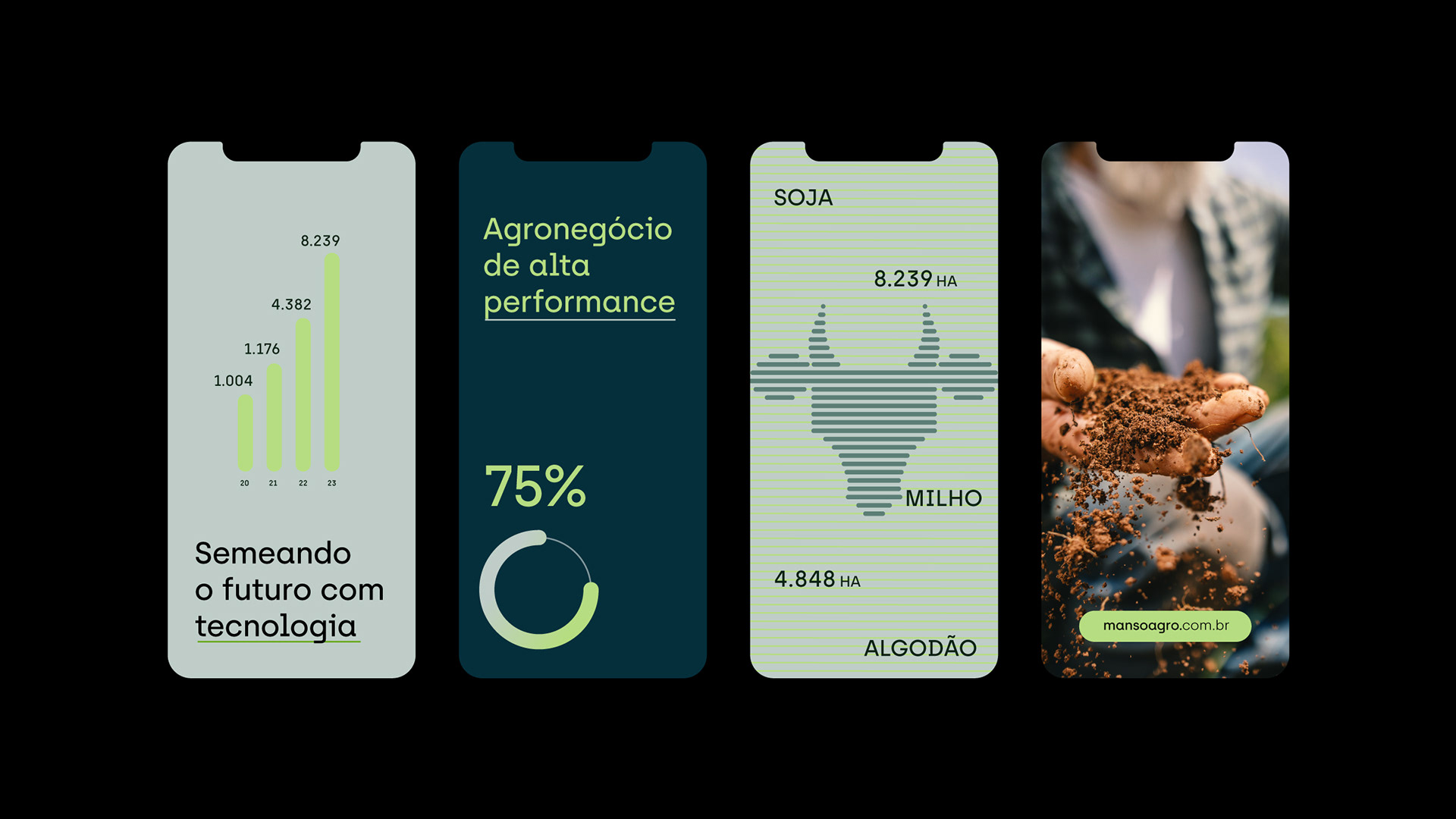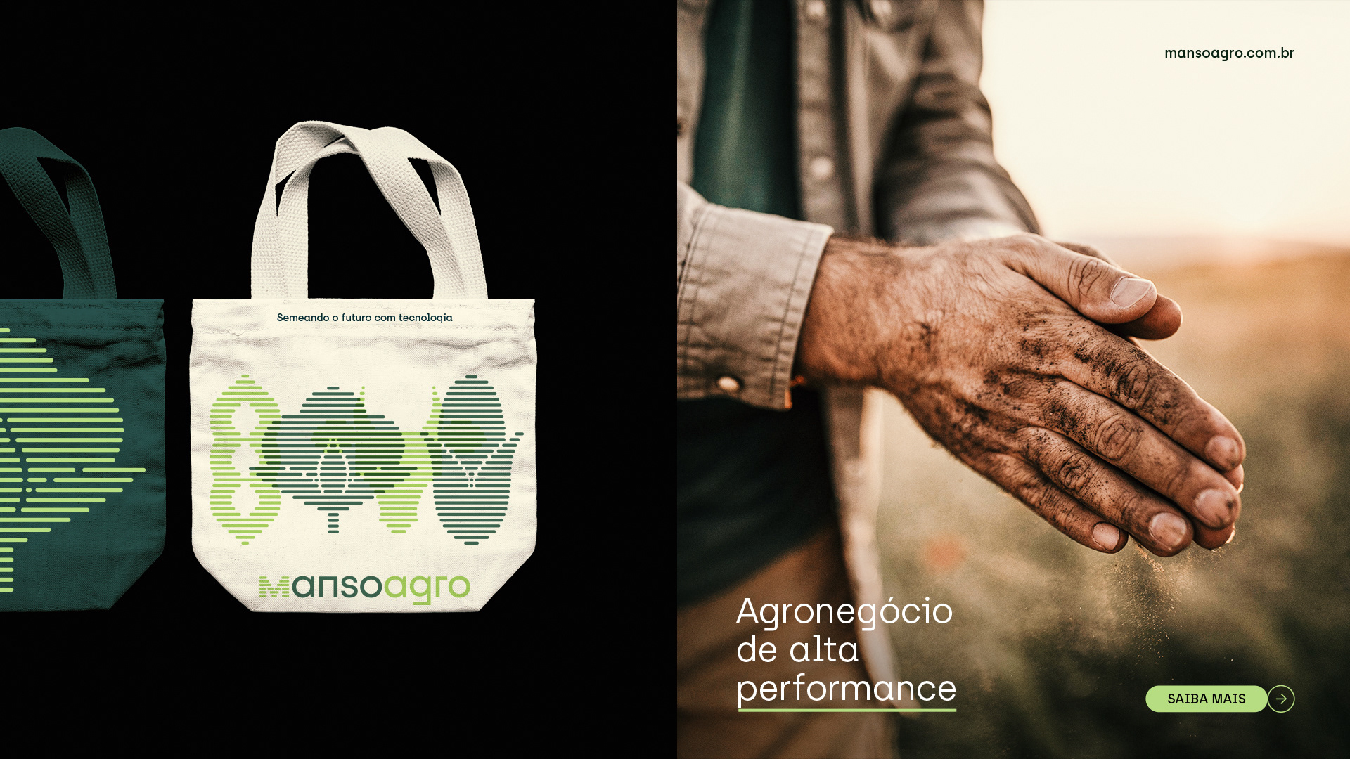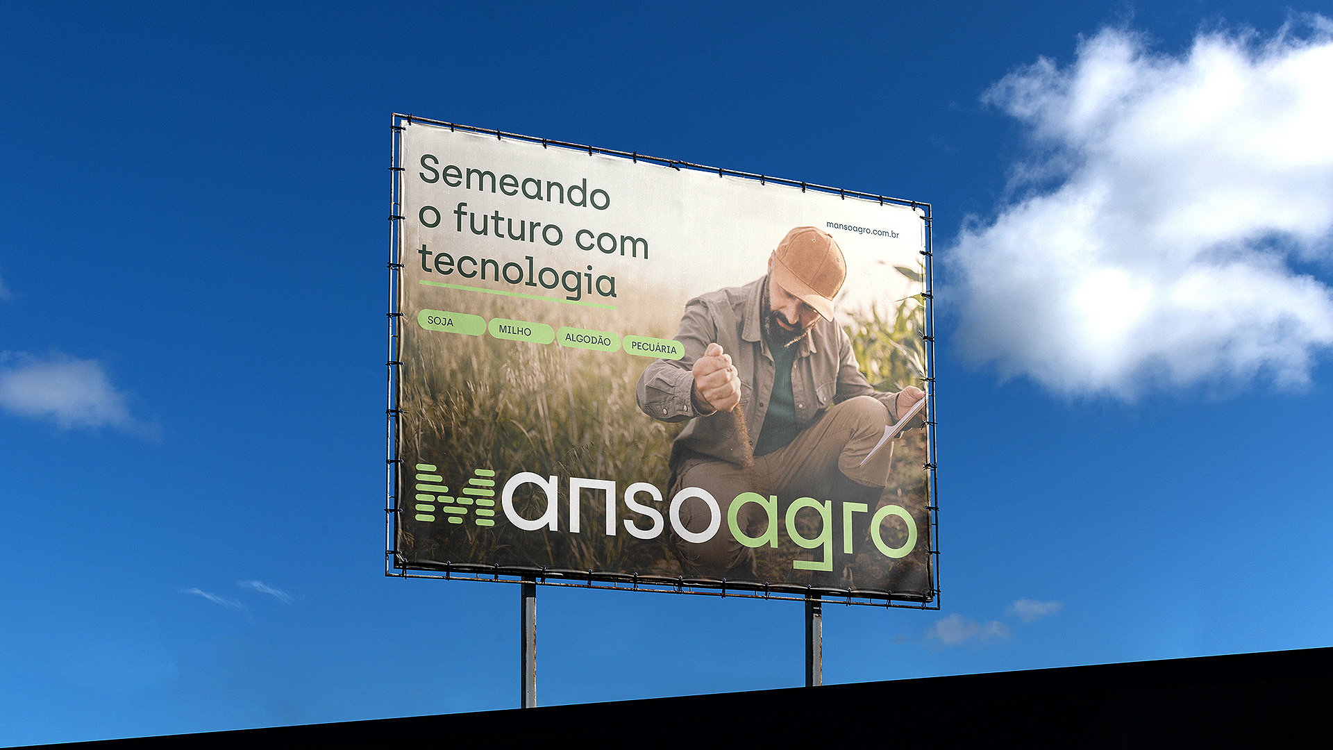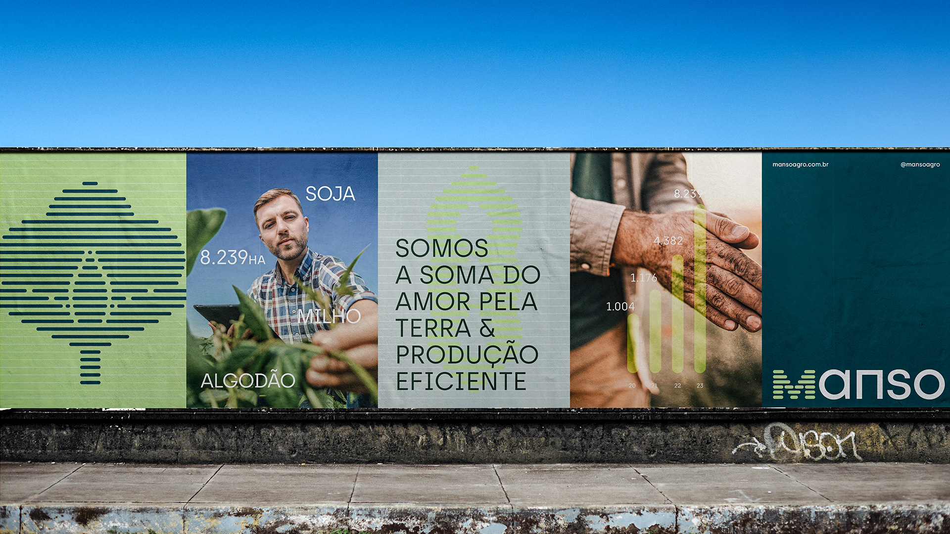
Manso Agro is an agribusiness company with four major areas of operation: soy, corn, cotton, and livestock. To represent these four areas, we drew inspiration from the shapes of crops when viewed from above, creating line icons to symbolize each field.
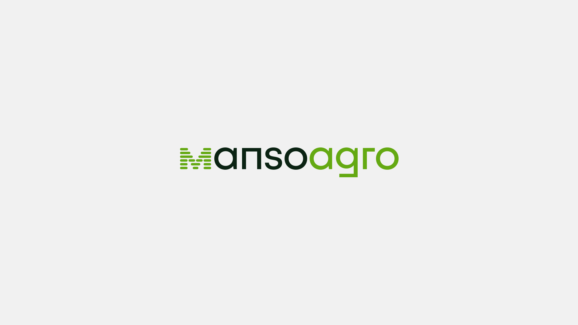
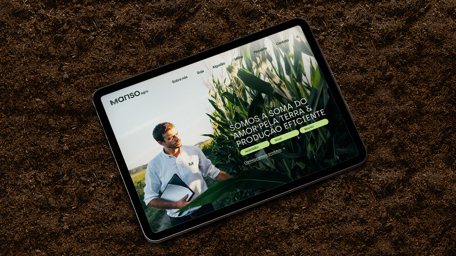
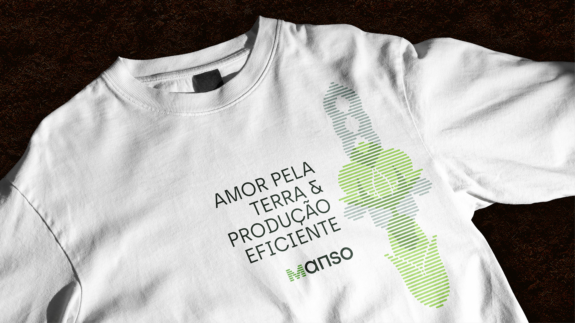
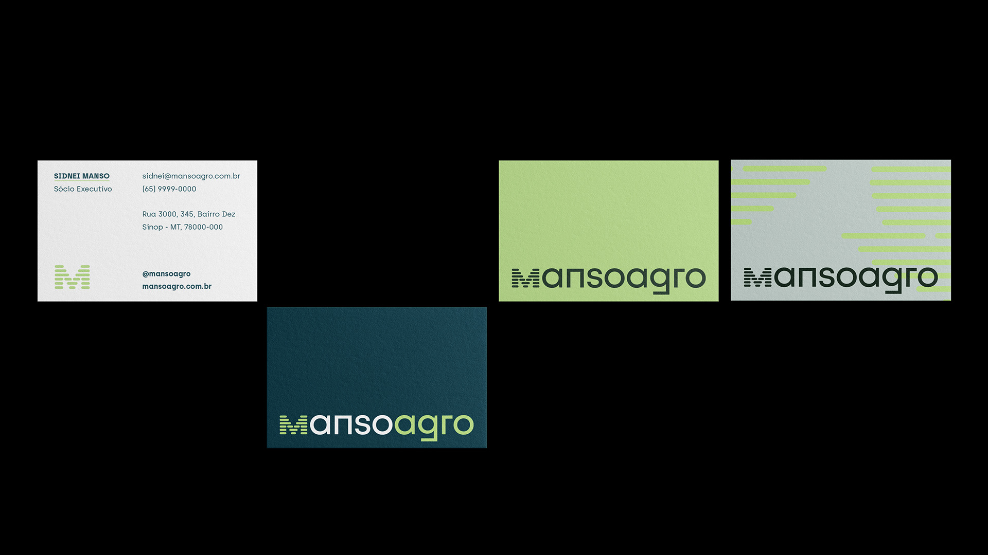
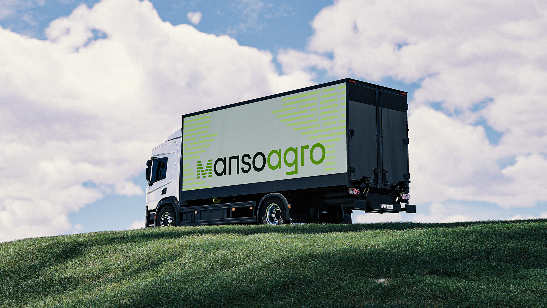
The logo was also designed with inspiration from the lines found in plantations, providing a cohesive visual identity throughout. The "M" in the logo can be used independently, serving as a strong symbol for the brand.
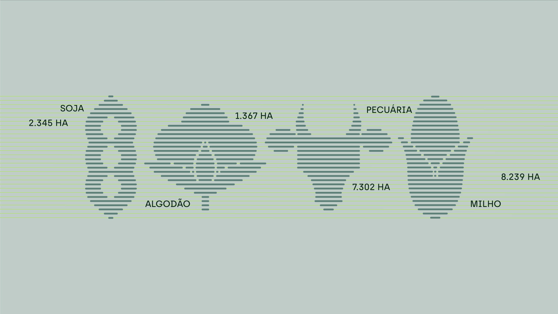
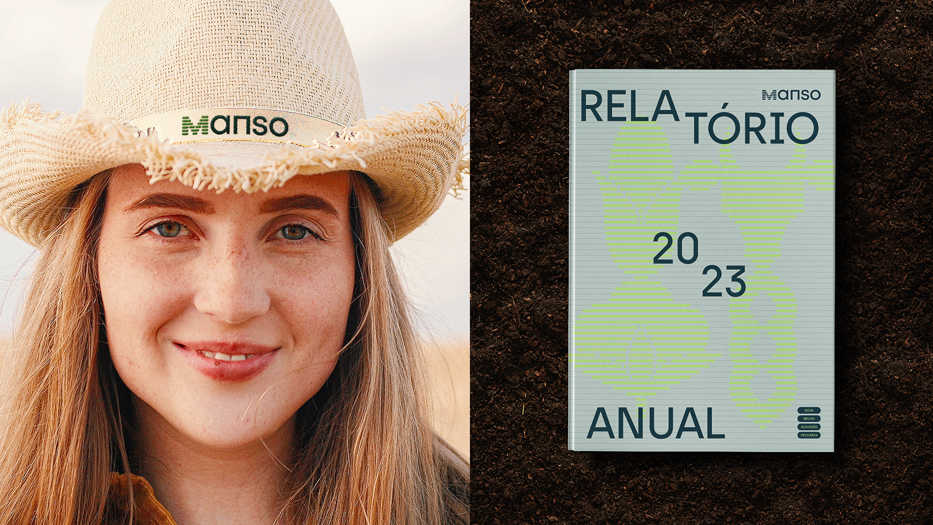
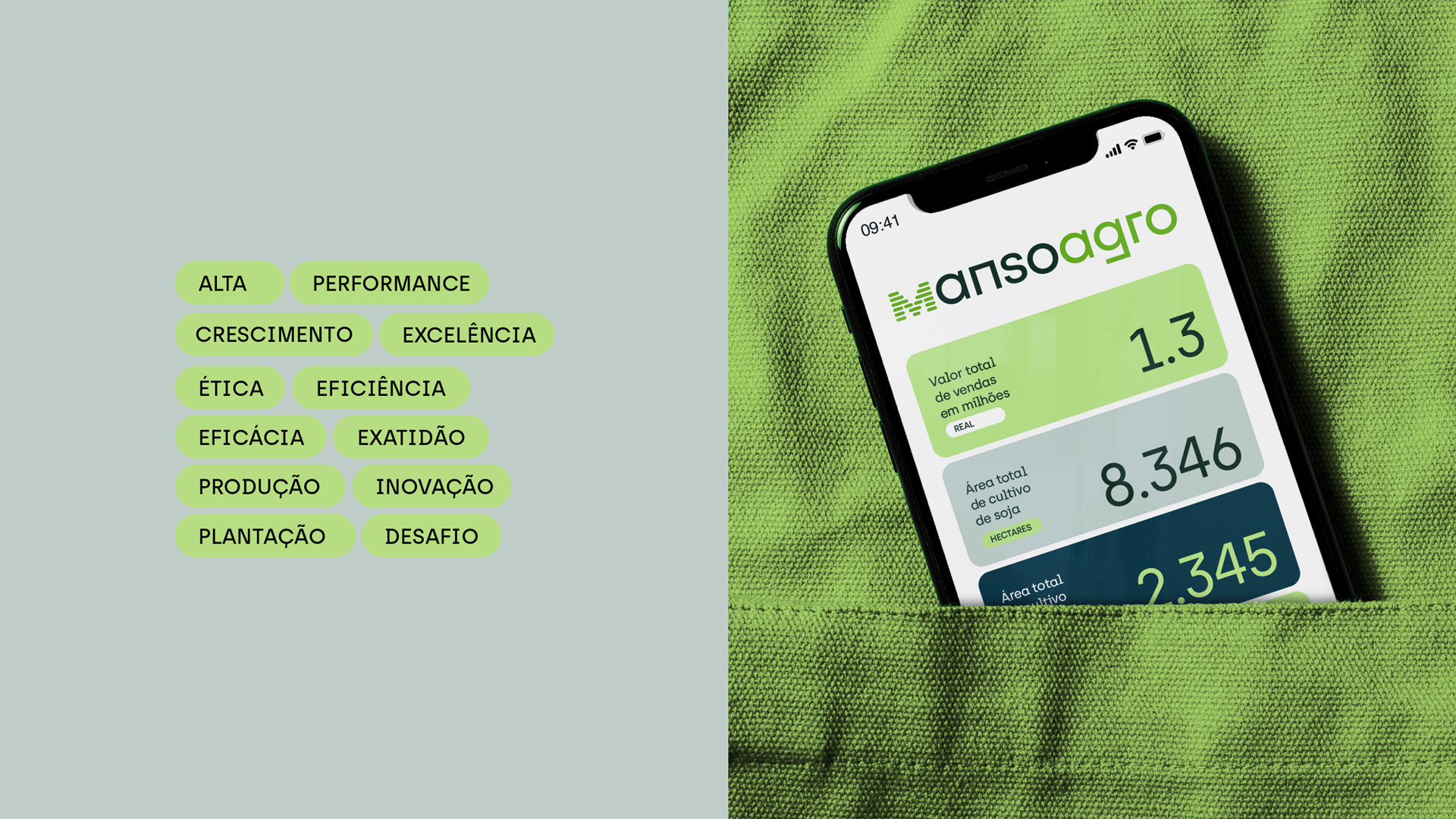
The result, growth, performance, and efficiency are crucial aspects for the company, which are clearly demonstrated by our figures. As a result, we incorporate charts, numbers, and metrics as key elements in our visual identity, reflecting the effectiveness and achievements of Manso.